Feedback is a critical catapult to success for any student, school and industry…
Read MoreHow to Tackle Creative Feedback


Feedback is a critical catapult to success for any student, school and industry…
Read MoreI leveled up…
Read MoreWon first place, established a name for my lighting and imaging abilities…
Read MoreIt's been a year since I started 3D. I chose Gnomon's FX track..
Read MoreFor the final in my Intro to Maya class…
Read MoreI utilize every class presentation as a chance to practice public speaking…
Read MoreThese photos are a result of a collaborative journey between multiple creative minds…
Read More
Demos, Challenges. Things I've learned.
Two set ups x 23 people.
Didn't use strong enough lights for my set up.
Photographers: Lanli Su & Ziyan Zhang
MUA: Stephanie Santillan, Nicolas Dela Torre & Alison Roberts
Set up: Kyle Bennett, Jin Shen Wong, Steven Turner
Resources: Christian Soriano & Christopher Wang

It was a year since I used my camera. Decided to jump back into with a casual lifestyle photo shoot with Darlene and some studies. I spent a lot of time struggling with colors. I wanted to achieve an organic film look with richness in colors, a lot like my daily inspiration Joe Pugliese and Krystle Wright.
Here are some edit overs I did for my friends:
Portraits by Andy Wong
Long Essay Post with Jemmie Truong
Landscapes by Tony Michaels
I work with Young Storytellers to instruct 5th graders from low-income families to write original scripts to be later adapted for stage by professional actors.
For our Design History Final, we forecasted designs in areas of: architecture, interior design, product design, graphic design, and costume/fashion design. I approached my research by accessing FIDM's trend database to pick out the trends I think will be long lasting.
Trend is an important factor when it comes to consumer design. Therefore, trends forecast reflect on social commentary and current events to achieve the goal of creating high market value products. The most authoritative trend consultant for fashion and creative industry is WGSN.
For example, when Nike comes up with a selection of color for a shoe line, the color is not a random choice. It is selected through series of expensive data analysis and consumer research. Not only is this process frequent when it comes to consumer products or fashion, it is prevalent in film genres, tv shows and advertising.
In short, if you want to make money in a creative field, you must listen to what your consumers/audience want.
Of course, creative freedom is very important for any artist. But personally, I want to design with purpose and create things that speak volumes and reach everyone. Therefore, I am pro-data.
Here are my choices:
Organic forces and elements provided by mother nature inspire this earthy trend. Energetic winds and volcanic clouds suggest volume and depth with elemental influences adding textures from porous surfaces to lustrous finishes.
Here are some key words I found to better visualize this design style: smoky textures / escapism / transparent fibres / enchanted textures / ethereal glow / lightness / shadows & overlays / pale minerals / soft focus / crystal forms / naturally porous
I prefer this over sci fi and tech designs. I see this most prevalent in the area of graphic design and editorial photography. But let's talk about the animation world here, because this relates to the analog vs digital conversation, in terms of aesthetics and design usage. With CG and 3D modeling thriving, I think the best designers know how to integrate modern technology with traditional medium. There will always be a conflict between traditional 2D/stop motion versus 3D animation. Hand drawn and hand crafted have a special quality to them but large studios will always prefer 3D and digital because it's faster, cheaper and bigger.
But if you can use 3D as a tool and not see it as a genre, then you can pursue any medium or style that you want.
Examples of this are: how Disney used 3D modelling to create a hand drawn short "Paperman" or how Laika studio uses rapid 3D prototyping to create seamless stop motion animation at a large scale.
Images above are from Jim Hodges and Matt Wisniewski.
The products above are eco-friendly products made from re-purposed materials.
From left to right: Kyoto State Cold Brew Tower, Coffeega Cold Drip, banana peel fabric, pineapple skin fabric, coffee fabric and shoe skin, colored salmon skin fabric.
"Eco-friendly designs is a growing design philosophy and trend of sustainability, the goal of which is to create a system which can be supported indefinitely in terms of human impact on the environment and social responsibility. The product is created and produced with consideration to the environment and social impact it may have throughout its total life span, including its carbon footprint." -Wikipedia
I believe as technology advances and more people are becoming aware of affordable green lifestyle, this trend will be and ongoing one.
Over the years, gender equality is being achieved over all sectors of society. I think that this color combination challenges the traditional perceptions of color association:blue is for boys and pink is for girls. It's important to note that this is Pantone's first time choosing two colors as their color of the year. This selection is a social commentary and drives conversations of issues about support for the LGBT community, toy sections at Target or transgender bathroom laws, etc.
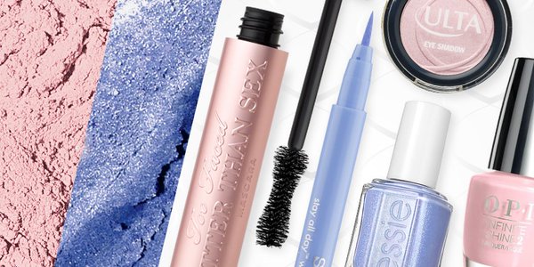
Dreamy, milky and soft, pastels aren't just for nursery rooms anymore. They have grown to become sophisticated over the years. It has made it's way into advertisement for banking, interior design, product design, cosmetics, and tech, etc. As people seek mindfulness and well-being as an antidote to modern day stresses, welcoming colors that psychologically fulfill our yearning for reassurance and security are becoming more prominent.
"In many parts of the world, we are experiencing a gender blur as it relates to fashion, which has in turn impacted color trends throughout all other areas of designs (product, graphic, interior, etc.) This more unilateral approach to color is coinciding with societal movements toward gender equality and fluidity, the consumer's increased comfort with using color as a form of expression, a generation that has less been concern about being typecast or judge and an open exchange of digital information that has opened our eyes to different approaches to color usage." - Leatrice Wiseman Executive Director, Pantone Color Institute
Color trends, in general, have a large scale of impact on all creative industries.
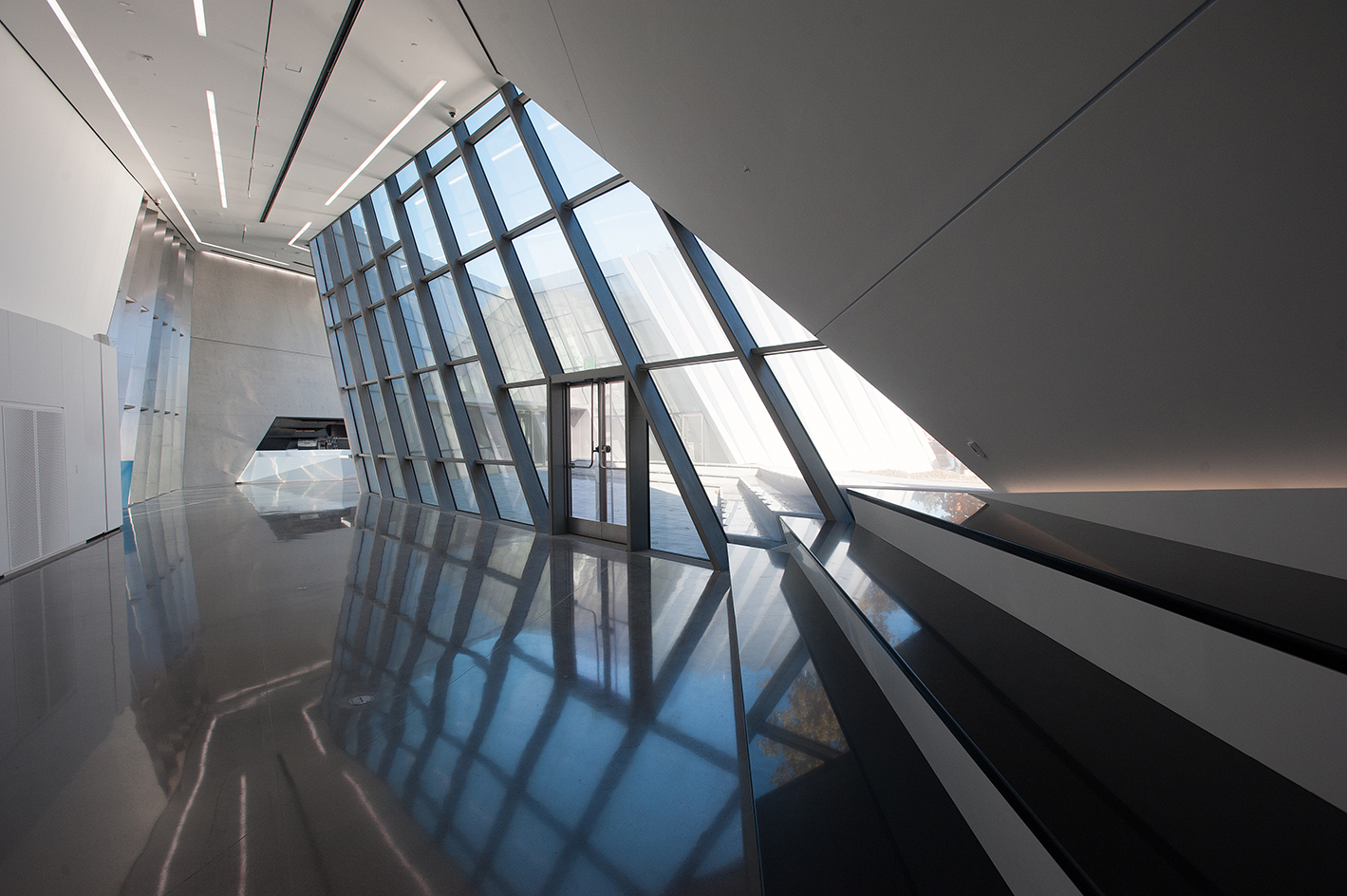
3D printing in design is not new. It became popular in high end fashion and consumer design two years ago but now architecture is finally following up with it. We will see more of this architecture in the following years, ones with elaborate and explosive details.
If we take a look at the costumes nominated for the Academy Awards in the recent years, they all encapsulate handmade qualities, from hand painted fabric and hand sewn embroidery. Not just costumes, but everyday objects as well. I think 3D printing will not become a desired majority when it comes to consumer design.
The architectures in the images above are: The Broad Museum, Los Angeles and the Michigan State University Museum.
Here's my week 7/11 of term 3 update! These are some of the assignments I did the past few weeks. I feel much more confident in my drawings this term, especially digitally.
Some things I'm working on right now: preparing for more workshops and events, fixing my sculpture, fine tuning the script and story boarding my movie, a painting for my Color Theory final and reading a lot more books! I'm excited to share the final products with you later!
As far as workshops, I got 4 planned out for the next term. And people are offering to help during the workshops and demos! It's so rewarding for me to see people sharing with others what I showed them! I got asked to do a workshop at another school too, I had to turn it down but still, it was cool. Haha.
Oh, I got to chat with Iain McCaig! He and James Clyne came to our school to give us the heart of Star Wars and storytelling. It was a career defining moment for me :D
Other than keeping myself busy, I've been focusing a lot of mental health this term. I need to exercise more and drink less coffee, been feeling more sluggish lately.
:)

Following my DSLR workshop, a few people and I from the club went to practice at the National History Museum. This location offers a variety lighting obstacles, from under-lit and over-lit environments, making it perfect to practice exposure.

Photo by Wong Jin Shen
The photos above are my photos, shot with a Canon 5D Mark III and a Tamron SP 24-70mm f/2.8 DI VC USD. But I never learned as much as by having to verbalize and show others how to do it. So for practice, I will be editing and evaluating the photos that Jin shot on a Canon EOS Rebel XS.
I love how he composed his shots of the dinosaurs, it's dynamic and energized. Jin's DSLR had the lowest range and built of the group. With barely half the megapixels count and 1.5% of the Mark III's ISO capacity, the problems he had to solve were different than others:
Scenario
Dark lighting condition requires more light entering the camera. This can be done by having a high ISO, slow shutter speed and/or wide aperture.
Problem 1
Jin's DSLR had a confined 1600 ISO and a kit lens with max f/3.5 aperture. Under the exhibit's dark lighting condition, he would have to use a slower shutter speed to not underexpose the image. Problem with that is he didn't have a tripod, and any slower than a 1/60 shutter risks camera shake.
Also, there is a lot of image noise by having to use the max ISO.
Solution
Shoot in RAW. Underexpose the image a bit to avoid camera shake and do a post-edit.
Problem 2
Gave him my prime 50mm lens with a max f/1.8. The wider aperture allows him to use a faster shutter speed. But with that, the shallow depth of field became problematic when he wanted to shoot fully textured rocks (image 3-5).
Solution
He can take multiple photos with different focus range and do a focus stacking in Photoshop. It'd be better if he had a tripod. Or he can just stand further away from the subject, and then crop in edit. But with the camera's low megapixel, the resolution wouldn't be desirable.
Jin should get a better camera... Haha.
If he wants to go pro. Because this Rebel XS is only good for consumer level. I mean, the iPhone 6 has higher resolution than this camera! For a prosumer level camera (not 'pro'), the Rebel t5i is best for beginning DSLR-users who want to produce media content.
But if not, then he should use a tripod and shoot in RAW so he has a wider editing range. Below is an example of editing a JPEG vs. editing a RAW. Notice how crunched the pixels are when not shooting in RAW.


A note to consider when exporting JPEGS to post on web:
If you're editing in Photoshop then don't Save As... JPEG. Instead, Export>Save for Web (Legacy). This will ensure your photos being the same colors on different viewing platforms, like on a mobile (look below).
If you're editing with Lightroom, then the image automatically exports as web legacy.


That's it for now. Till next time!
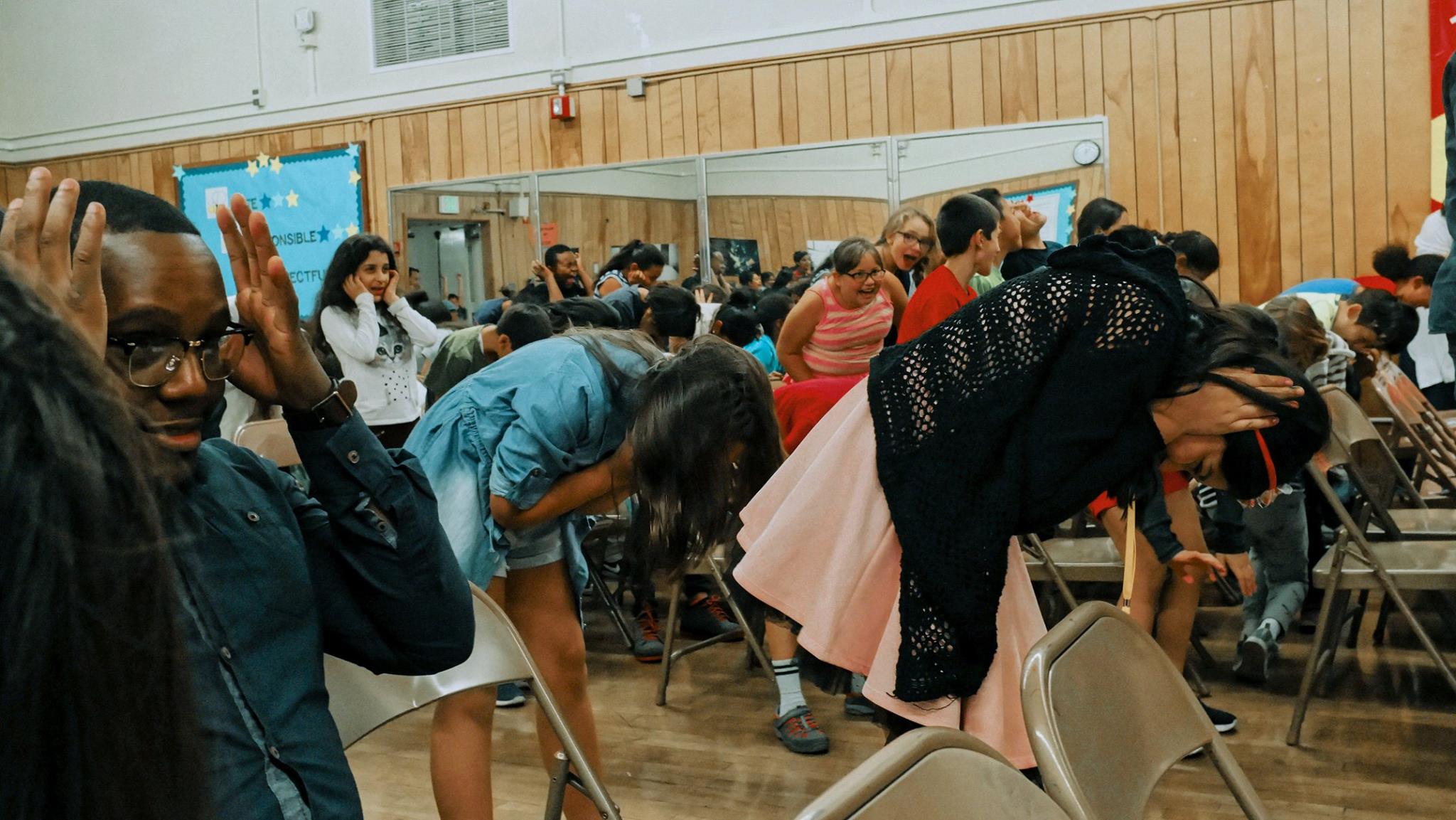
Hosted my first workshop today and boy, was it nerve racking! Using a DSLR comes as second nature to me, but having to break it down to teach others helped me gain more in depth knowledge for the craft. The protege effect was in full force here!
My problem solving skills to work under pressure were put to the ultimate test today.
Understanding DSLR and photography lingo can be very confusing and overwhelming. I had only one hour to explain everything. I had to break it down into simple and concise steps, as if how I'd want someone to show me when I first started. I told everyone to bring their cameras to follow along with my live demo. It was essential that I can show how the numbers relationship in the works.
I spent a lot of time preparing for this and did run throughs in the room I was presenting. I found out I had to switch to a different room that doesn't have adequate equipment thirty minutes before the workshop. There were so many technical difficulties - the live cam and the computer programs kept on shutting down. As much as I prepared, I didn't plan for this. There is full classroom of people watching me and time was clicking. I improvised, disregard the techs after a few more tries and just went analog. I only allowed my mind to work out different solutions instead of wasting time thinking: "Crap, this isn't working and I am scared."
Overall, it was a fantastic learning experience. With more practice, I will soon to be able to speak more confidently and relaxed.

I became President of the Gnomon Imaging Club three weeks ago. I was reaching for the stars and had to persevere through the intimidation. As a lower class man that barely started the program, I had to be able to structure the club to be beneficial to lowerclassmen and upperclassmen. It was difficult to create relevant events to Gnomon students because I had no prior experience to 3D, photogrammetry, texturing, etc. All I was sure of is that I love cameras. I have the eagerness to learn new things and I am passionate about bringing people together.
The objective of the club is to be a community for students to acquaint or strengthen their knowledge for techniques and materials that will aid them in cinematic storytelling. I create opportunities for students to share their area of expertise. I believe it helps students excel their craft and improve their professional presentation.
Being the first person to start something is scary, but I am fortunate to have a supportive peer and access to many resources. A lot of people helped me out to make the club happen. That's something I have to take a step back more often to remember.
After today, people came up to me about hosting their own workshop! It's really exciting! And the public media responded well to the event. Tomorrow I will take a few people to do location shoot to practice. I can't wait to see how much the club will evolve from now the following years come! And watch out, this isn't going to be my first demo! It's only going to get BIGGER and BETTER from here.
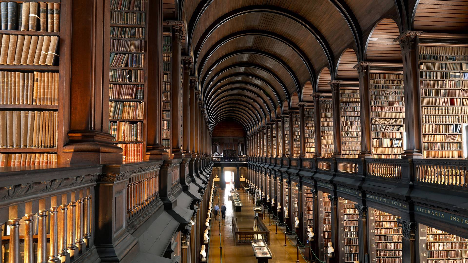
Asian pagodas and European Gothic Architecture truly fascinate me. I am most intrigued by the mathematical theory behind its architectural design and by that, the structures are engineered to withstand a great amount of force and age. The structures' harmony and balance, is representational in the repetition of symmetrical design. The ornamental curvatures create exciting leading lines and presents a powerful sense of movement in a strong stillness. With pagodas, each material and placement is selected for its conventional behavior and the relationship with sky and earth (feng shui). Especially with the Phat Diem pagoda, the blend between French Gothic and Vietnamese architecture makes this structure all that more eclectic.
For me, a successful costume design reflect the ideas and goals of the character. The design should communicate the character's tone and style, time and place and personality. I love historical, periodic and regional costumes and I think the best designs translate evolvement with purpose for cinematic realism. Having spent most of my life in Vietnam where I wore uniforms 7 days a week, movies and their respective costumes made an influence on how I viewed other countries.
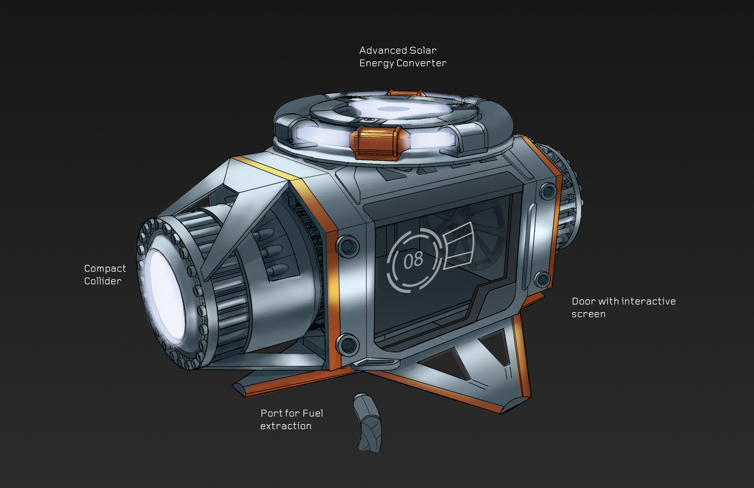
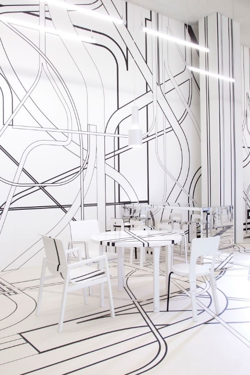
I appreciate interior designs that can transport me to a different world and are a bee to communicate a narrative of the space's intent and personality. With the Crew Dragon and the cafe here, there is thoughtfulness to the design's consistency of variation. The sleek simplicity of it feels meticulously planned for natural ease of use and comfort. The well balanced use of repetition establishes unity without becoming monotonous. The subtlety of curvature and directional movement are beautifully rhythmic.
For graphic design, I pursue the minimal typographic aesthetic and simplistic color palette. I like designs that optimizes usability and minimize time for complication. The graphics and packaging design of Clutch Body products reflect the science, quality and purity of the ingredients behind the supplements. As a consumer, the design speaks to me as: "Hey, you can trust us. We are here to improve your quality of life without taking away your time to deal with complications. We took care of all the math and hard work for you so that you can spend more time doing the things you want to do." As goes for the website interface design, it effectively communicates to me what I need to know with ease.
My aesthetic product design is similar to graphic design, optimal usability with minimal time for complication. The products I choose to use should only serve as tools that enhance and supplement my ability to create, not distract me from it. Nike and Apple products are good examples of the products that I generally use. I am also intrigued by how both companies have pursuit for visual appeal and functionality,aided with successful branding and marketing, makes their product to be social currency.
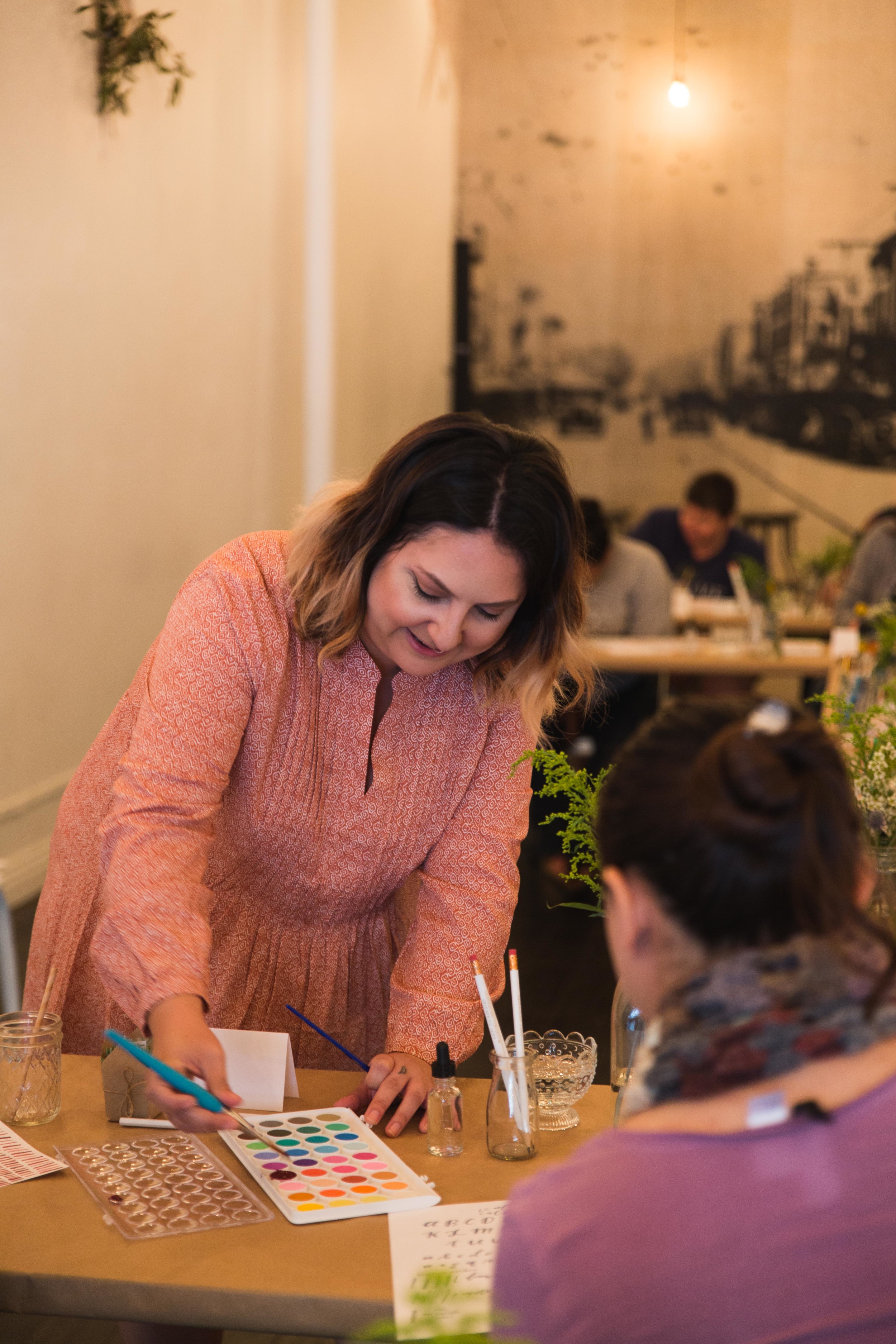
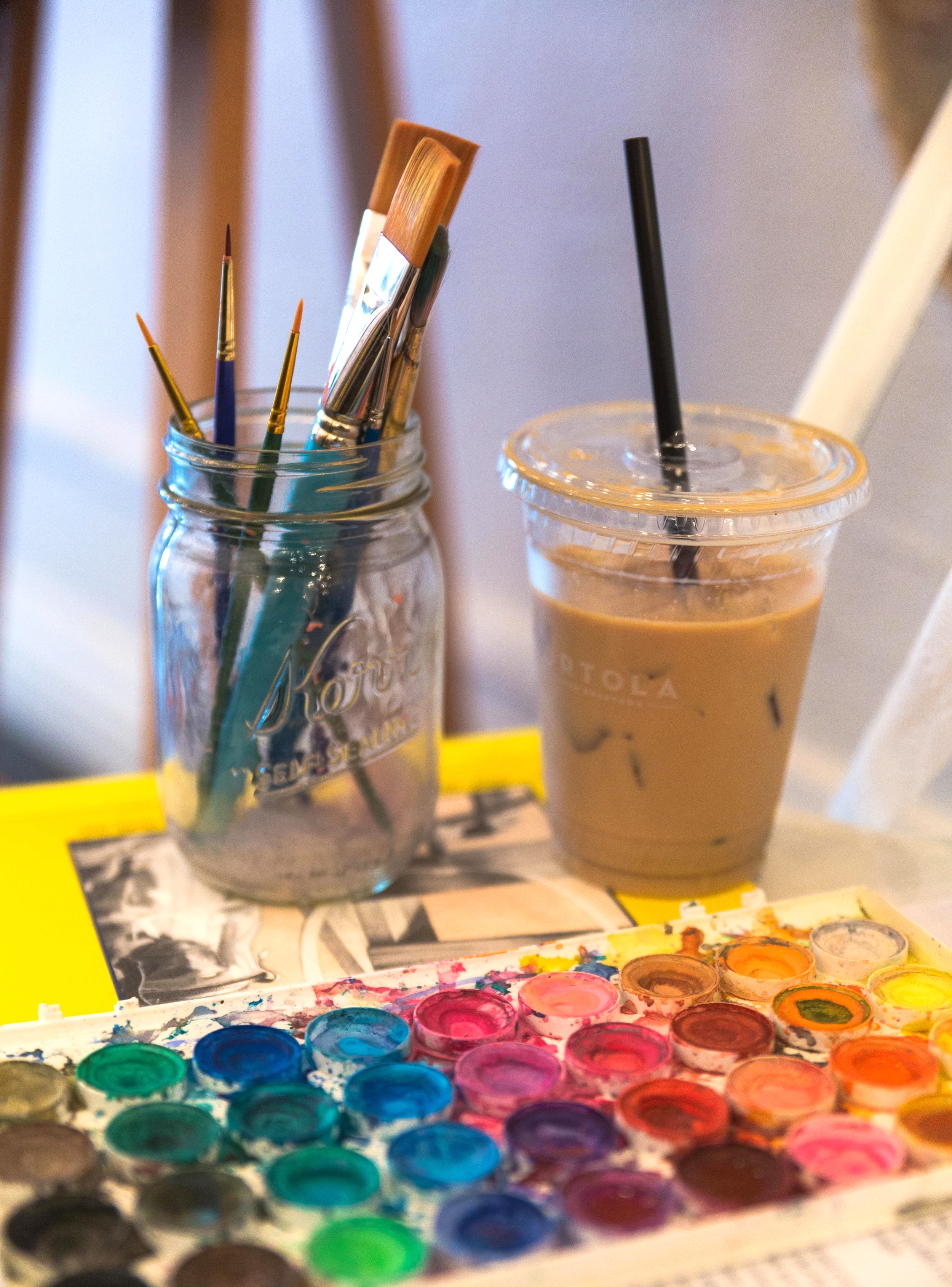
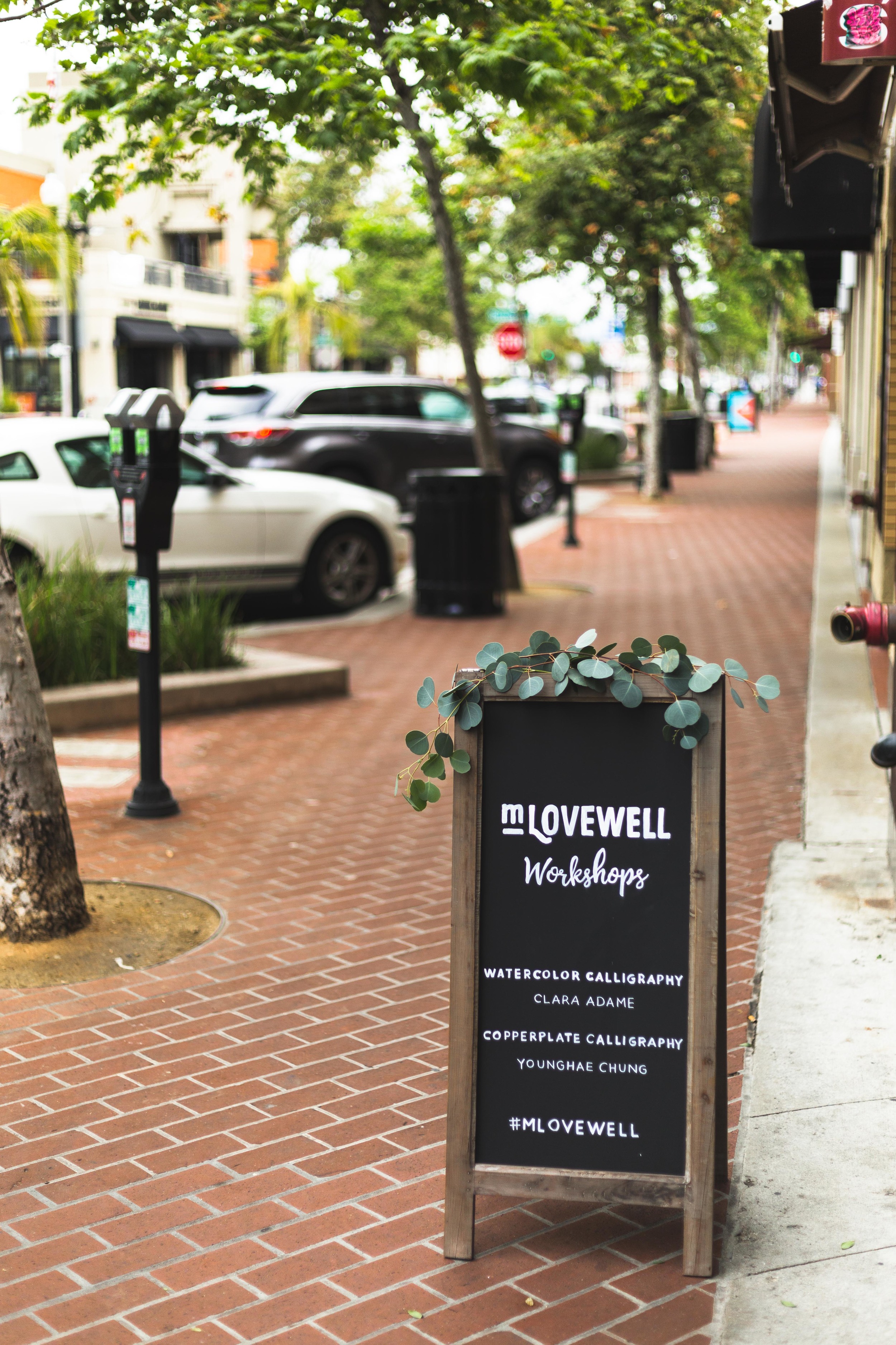
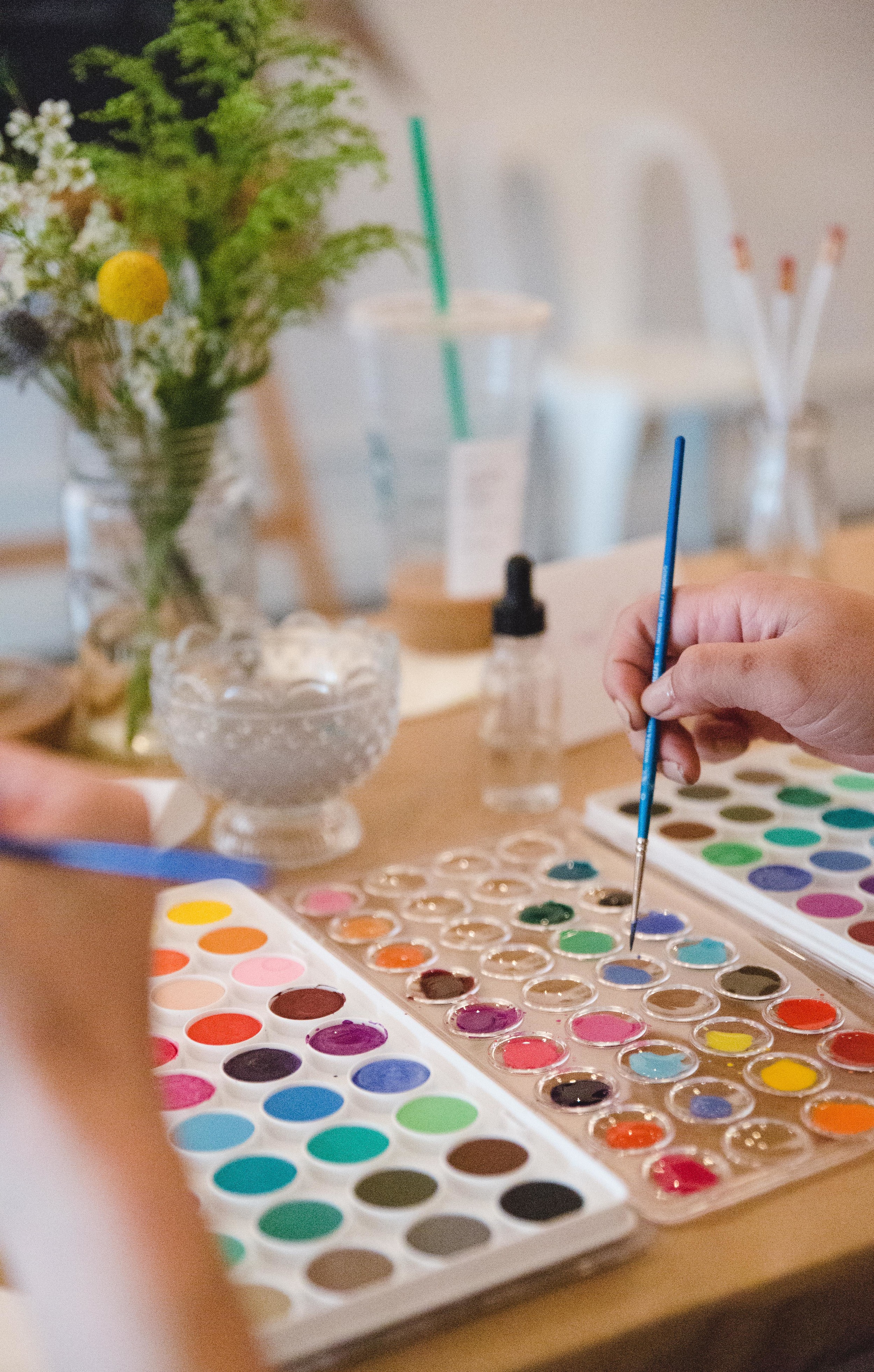
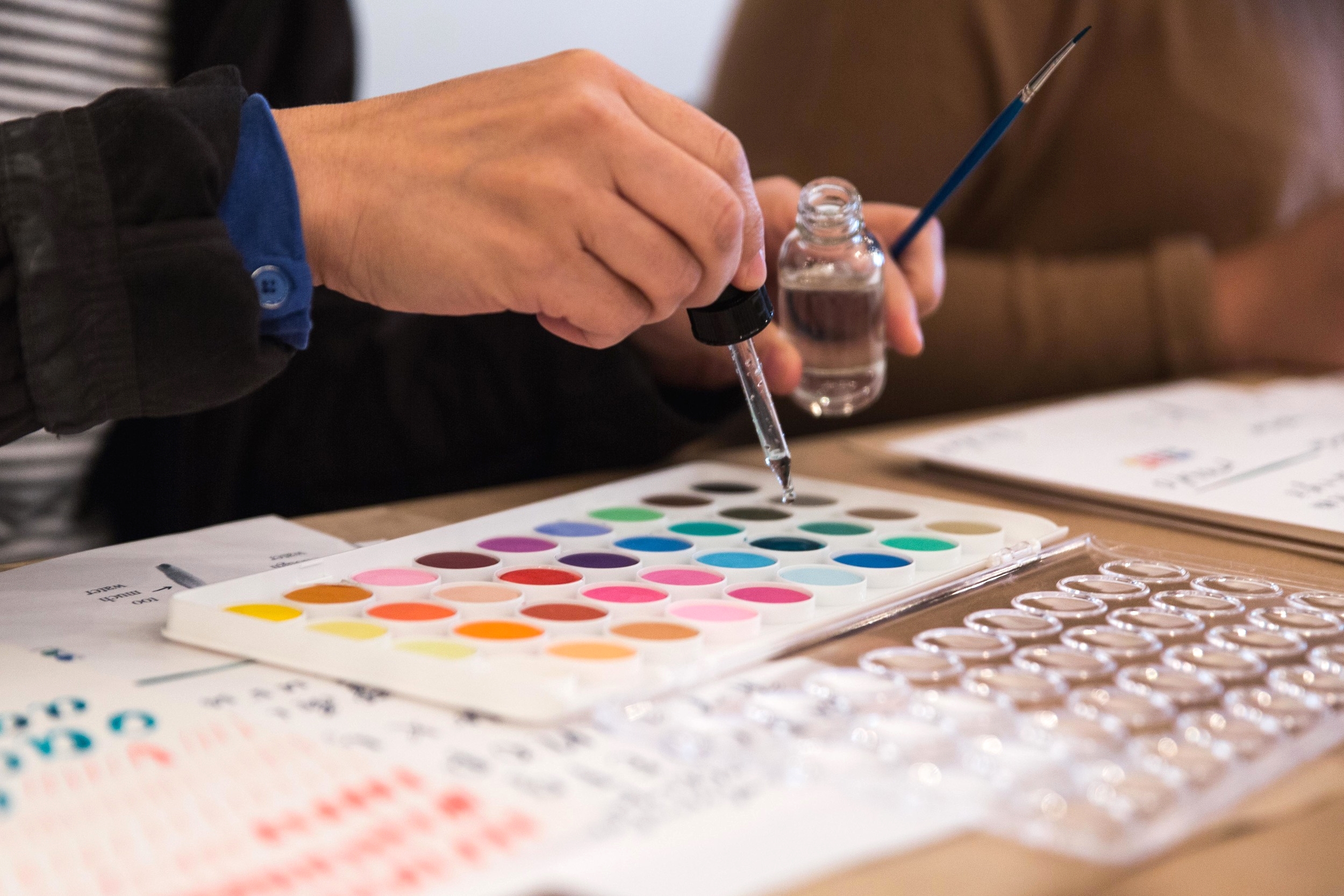
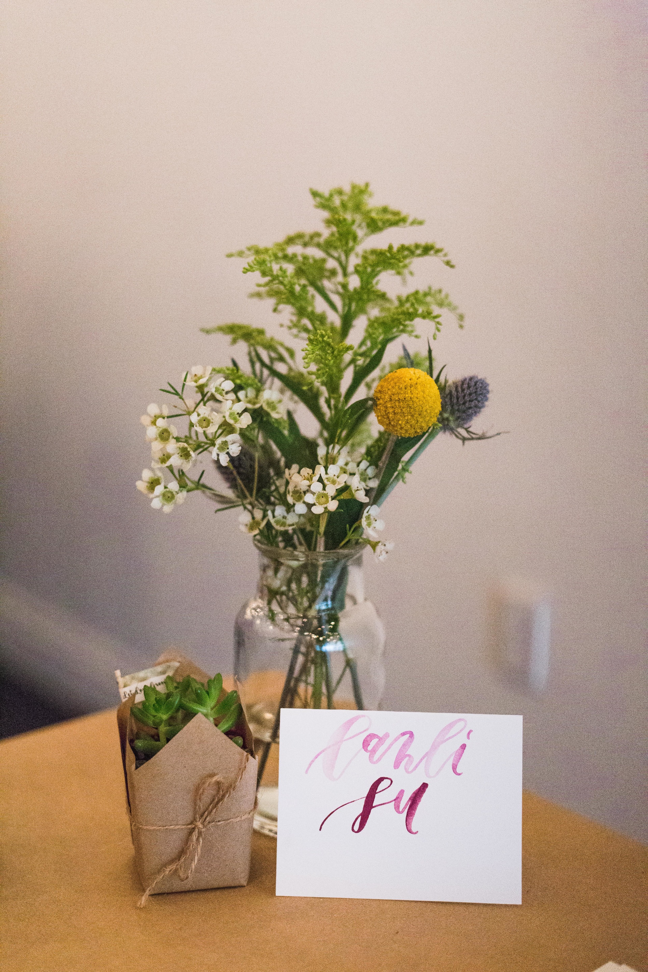
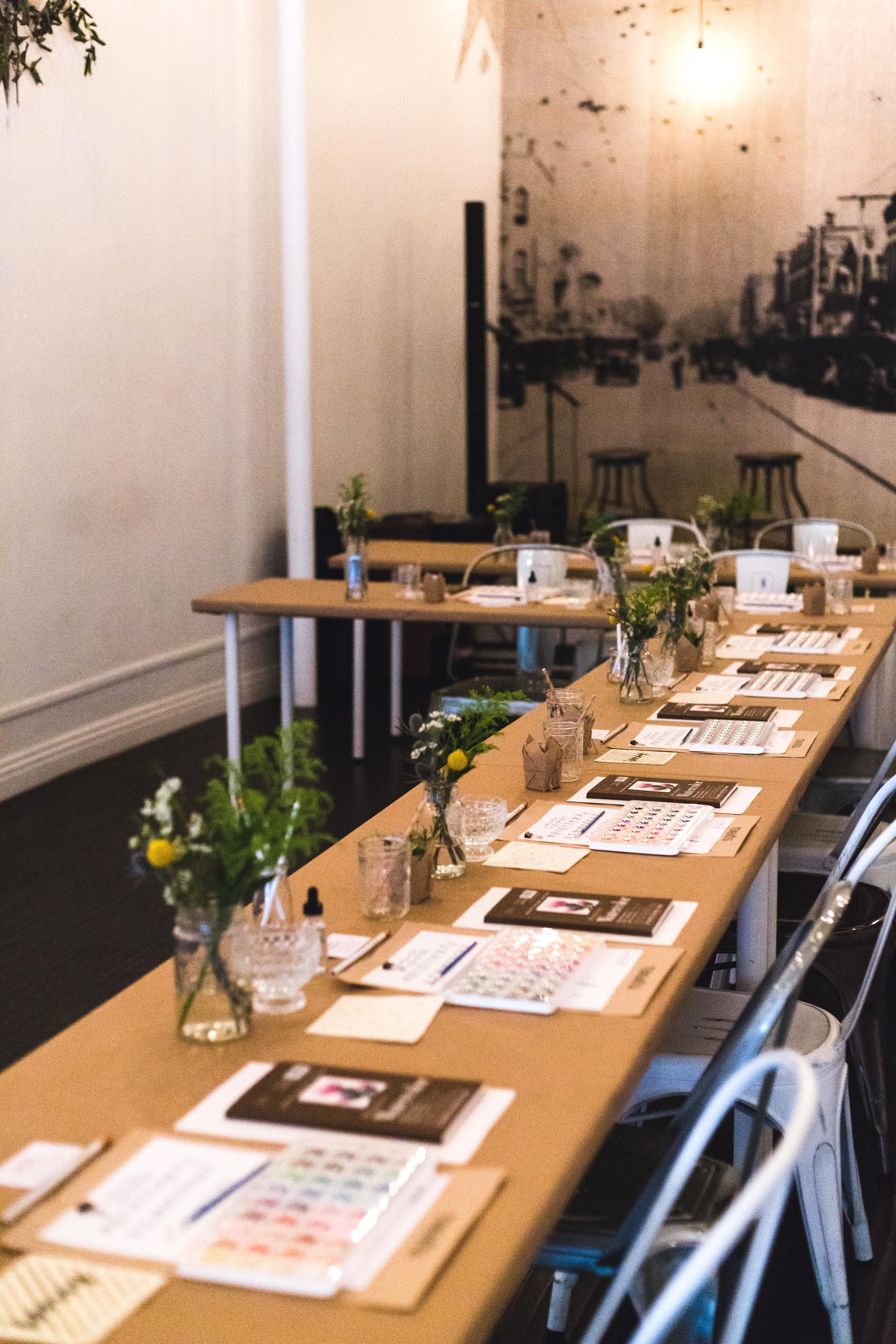
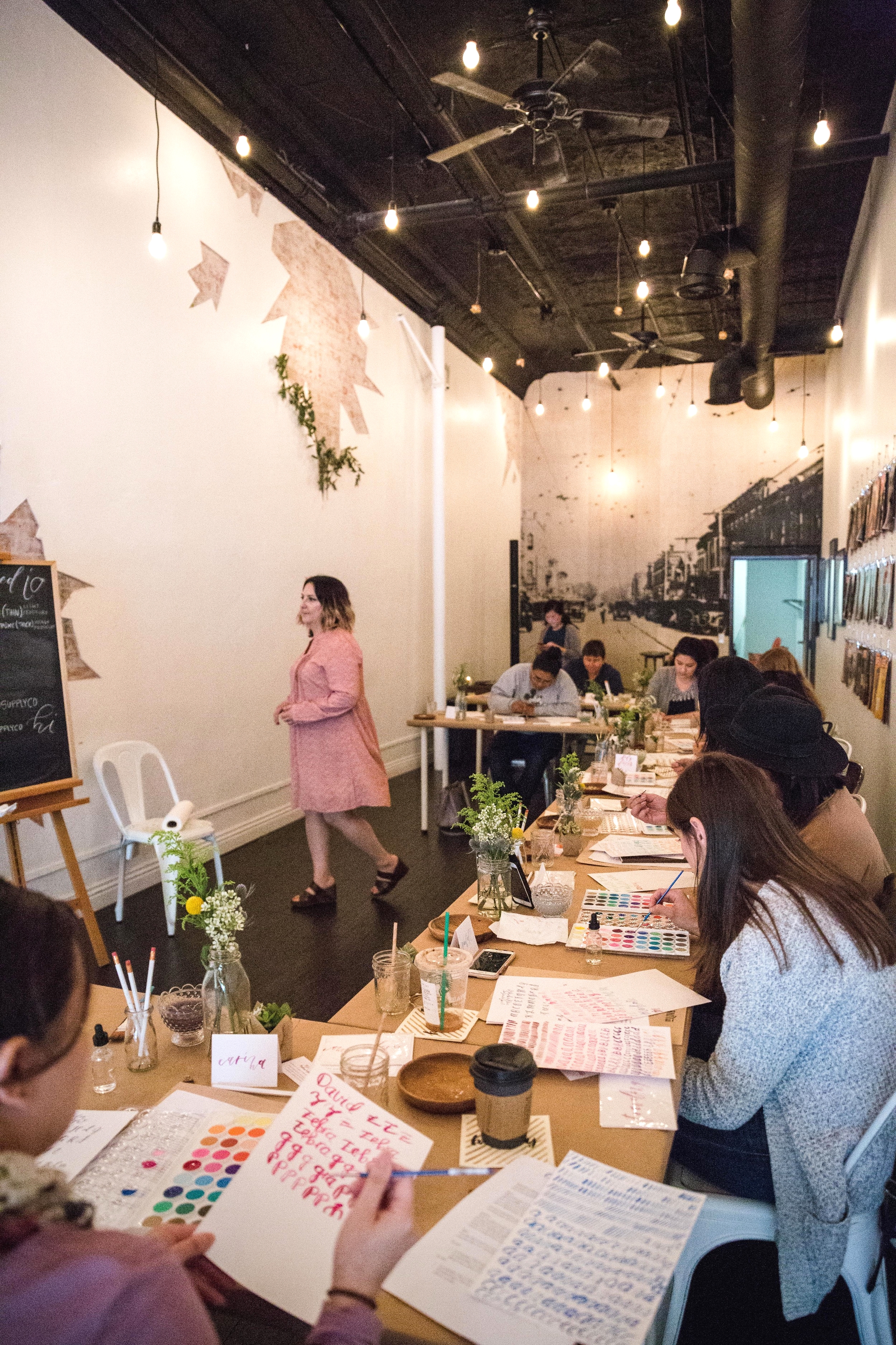
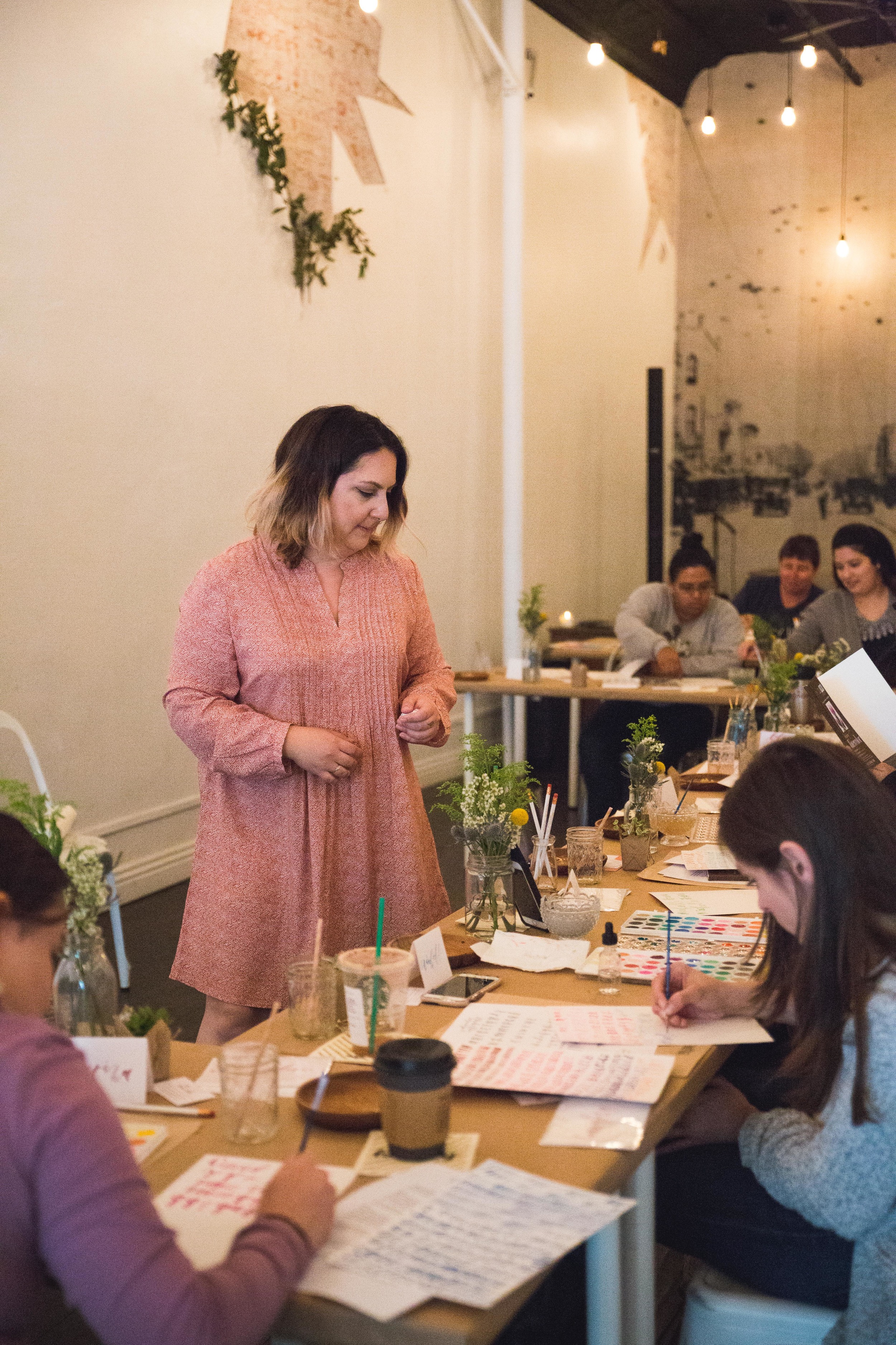
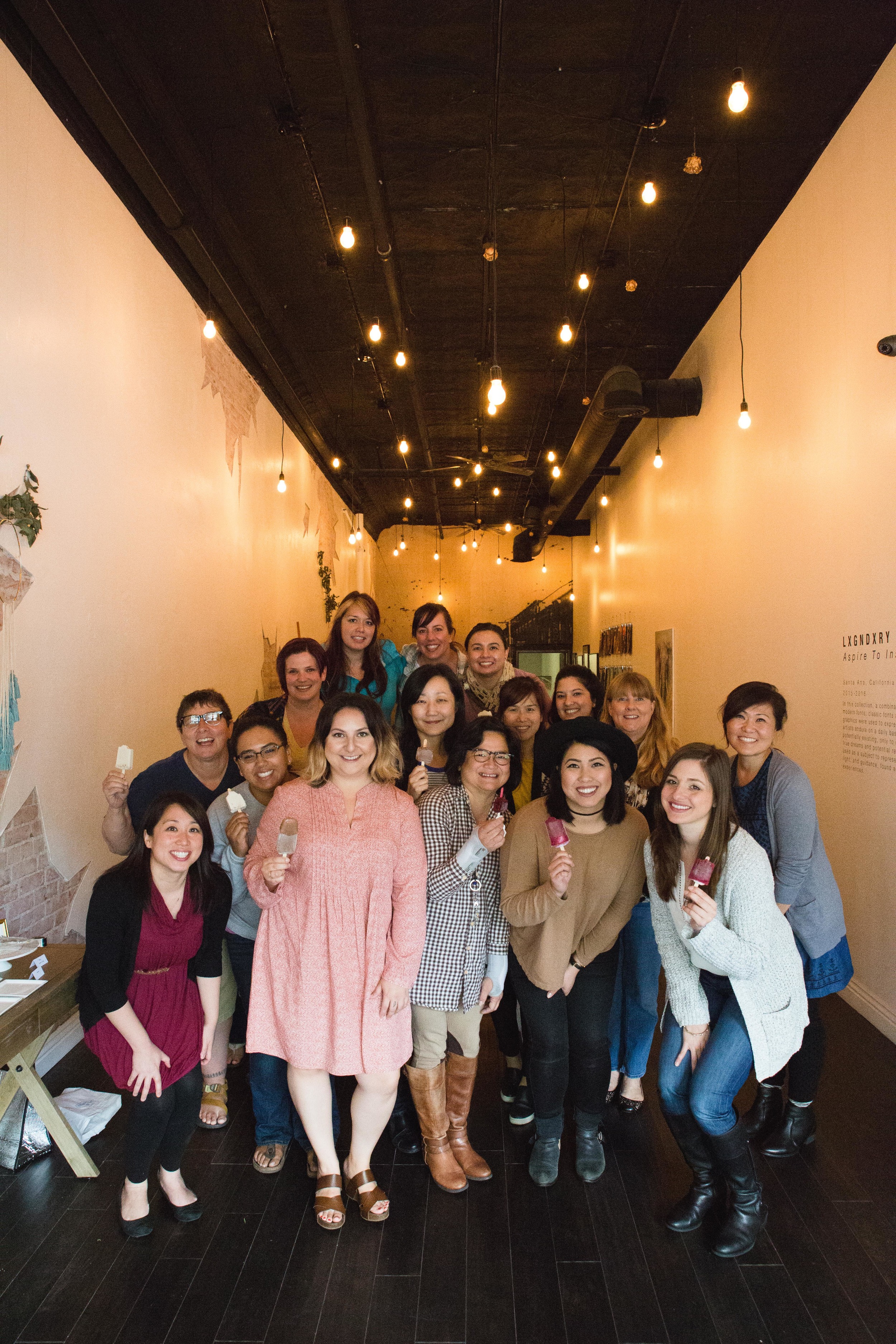
Took photos for my friends' launch of MLovewell, where they host a series of handcraft workshops. Check out their website for some cool calligraphy classes!
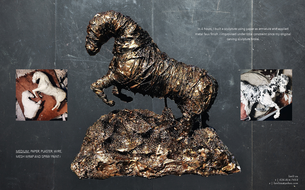
Over the course of 7 weeks, I designed and fabricated a sculpture display that with the goal of reflecting my cumulative studies of Ancient Egypt’s history, culture and legacy. I was inspired by The Bust of Nefertiti.
The final outcome was completed with the aid of a few family members and friends, from cutting flower petals to transportation. Needless to say, I couldn't have finished this in a timely manner on my own.
Till this project, I've never done any carpentry before. I spent most of my time fixing the base and masking its mistakes that came from poor preparation. The twisted planks I bought kept on warping from paint and heat exposure (plaster curing).
Roughly 60-70 flowers were made. Each petal was cut out, glued and sewed on to a toothpick stem. That was after several experimentations of what paper to use. This was the most time consuming part of the project. The entire head part was made the afternoon before due date.
Due to time constraint, I wasn't able to create the strong shape language with placement of flowers that I had planned. Nevertheless, I am satisfied with this project and plan to fix that and refine this more in the near future. Thanks for visiting!
I oversaw the production of an amazing team of 30 people.. With the team's patience and strong collaboration, we were able to achieve organizing, designing and fabricating a wedding for 600 guest in two weeks. Decor ranging from all floral arrangements, centerpieces to multiple 20 feet foyer walls. This was my first time planning/producing a wedding.
Photos are from Erich Chen Photography and the video was by Christian Soriano.

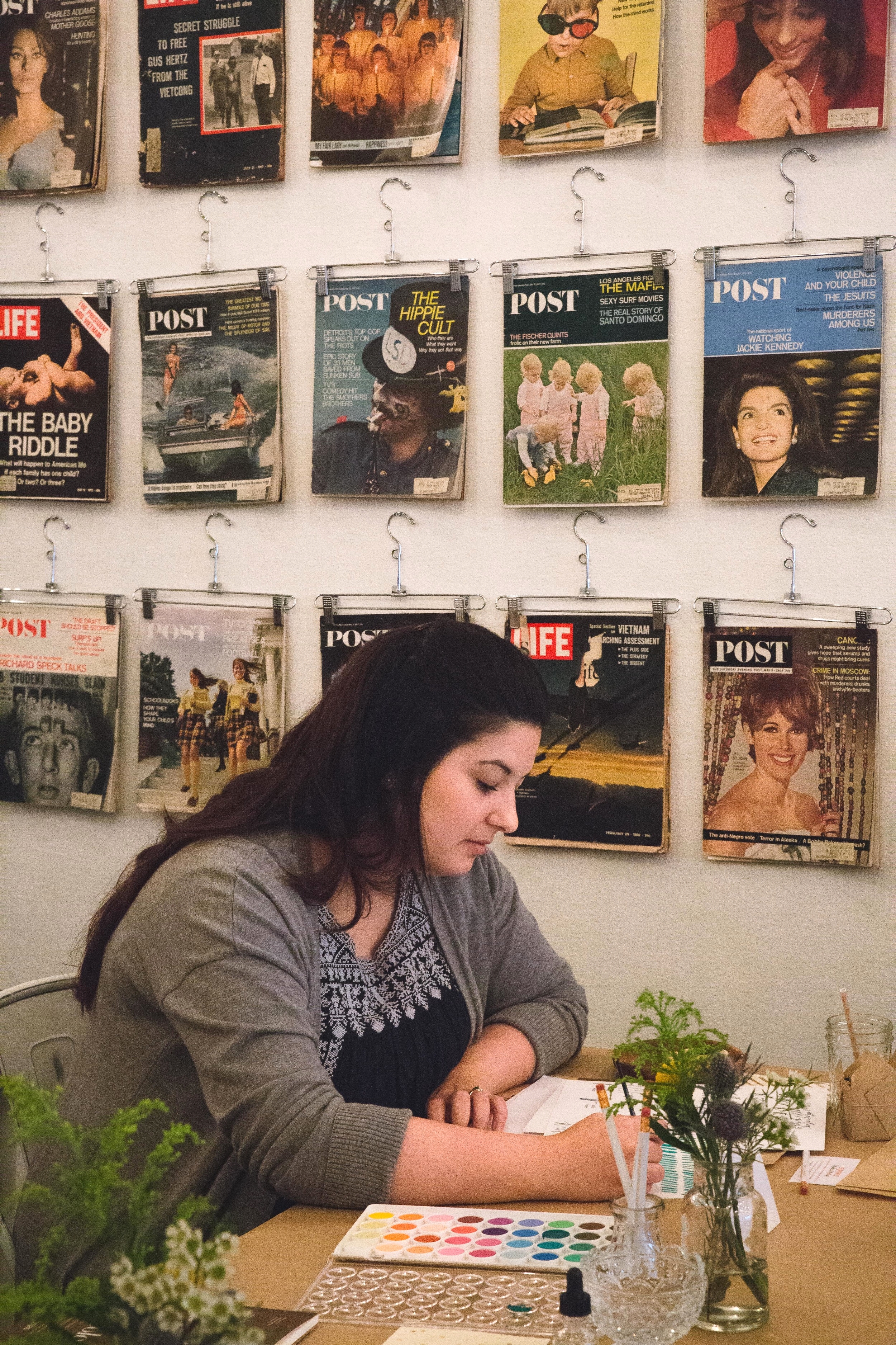
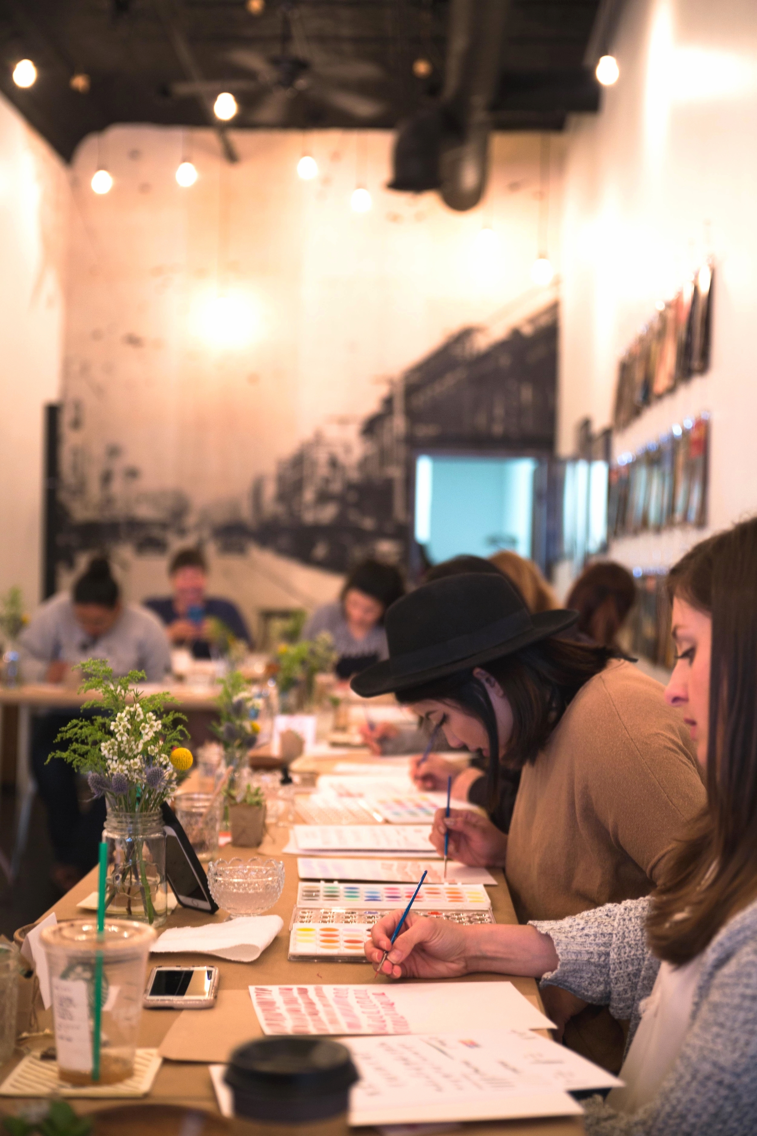
This is my graduate portfolio from the Fashion Institute of Design & Merchandising. My concentration was fabrication and set design. These projects were completed within 9 months and my portfolio was selected for FIDM's Top 25 Visual Communications Portfolios.
I used this to apply to Gnomon School of Visual Effects and got accepted into the 3 year program, Entertainment Design & Digital Production.